Visualizing Seismic Data with Matplotlib
Introduction
There are many Python libraries used for data visualization such as Plotly a Python graphing library that enables the creation of interactive, web-based visualizations, Seaborn a statistical data visualization library based on Matplotlib, bokeh a Python interactive visualization library that targets modern web browsers, providing elegant and interactive data visualizations for the web and more. However, Matplotlib provides a wide range of functionalities for creating various types of plots with a diverse set of plot types and offers extensive customization options. Matplotlib also has a large and active community and it is compatible with multiple operating systems, making it easy to create consistent visualizations across different platforms. For these reasons, we will use Matplotlib for visualizing seismological data.
Basic structure
The main structure of Matplotlib consists of the Figure and the Axes containers. Figure is the main, top-level area of the graph and it contains one or more Axes objects. Axes refers to an individual plot or chart inside the main Figure that hosts the actual plot or visualization. It is the area where data is visualized, including the coordinate system, data points, labels, and other plot elements. Note that Axis refers to the cartesian axis and Axes is the Matplotlib plot area. When you create multiple Axes objects arranged in a grid (rows and columns), they are often referred to as subplots. A standard use is to create a Figure instance and one or more Axes instances (plots) inside the Figure. There are many ways to achieve that, however to keep things simple, we will use the matplotlib subplots() function. It creates a Figure object and one or more Axes objects. It provides a convenient way to create a grid of Axes or subplots in a single call.
Start by importing the libraries that we will use throughout the tutorial:
    from obspy.core import read
    import matplotlib.pyplot as plt
    import pandas as pd
Initialize a Figure container with a single Axes graph inside it:
    # initialize the figure and a single axes object
    fig, ax = plt.subplots()
If you don’t define any parameters in the subplots function, it is assumed one row and one column in the grid, that means one Axes object (nrows=1 and ncols=1):
 A Matplotlib Figure container with a single Axes plot
In case you need to plot multiple plots in a grid, modify the nrows and ncols parameters of the subplots function. Let’s build a Figure container with a grid, of two rows and three columns, that is in total six Axes:
    # create a figure with 2 rows and 3 columns
    fig, ax = plt.subplots(nrows=2, ncols=3)
 A Matplotlib Figure container with a grid of 2 rows and 3 columns
Apparently, the plots are overlapping between each other. There are various ways to solve this problem. One of them includes the use of the plt.tight_layout() function to automatically adjust subplot parameters. This ensures that the specified subplots fit within the figure area without overlapping. Another way is to just set layout="constrained" in the subplots function:
    # adjust plots to not overlap
    fig, ax = plt.subplots(nrows=2, ncols=3, layout="constrained")
 A Matplotlib Figure container with a grid of 2 rows and 3 columns with adjusted layout
The return value of the subplots function that we used earlier, is a tuple of a Figure instance as the first element and a single Axes (in case of nrows=1, ncols=1) or an array of Axes objects as the second element of the tuple (in case of multiple Axes objects). When we have multiple Axes, we utilize the Python list indexing (subscripting) operator to refer to a specific subplot. For instance, in case of 1D array of subplots (e.g., nrows=1, ncols=5 or nrows=4, ncols=1) use the ax[n] operator to get the nth subplot in the array. If you have a 2D array of subplots (e.g., nrows=2, ncols=5) use the indexing operator two times to specify first the row and second the column of the subplot that you want to get (e.g., ax[0,2]). Remember, in Python everything starts from 0. The naming of the subplots return value does not matter. You can use “axes” instead of “ax” if it seems more straightforward (e.g., fig, axes = plt.subplots(nrows=2, ncols=5)).
Matplotlib Axes object contains several special methods that create various graphics or primitives inside of it. Such methods are the plot() method that creates a line graphic (Line2D), the text() method that generates a Text instance, the legend() method that creates a Legend object etc. There are many more interesting things in the documentation but it is way better to learn about the library while plotting real seismological data. Consider reading the documentation for more information.
Basic graph styling
In this section, we’ll explore fundamental styling techniques to enhance the visual appeal of the plot and include essential information to the graph area. This includes tasks like setting the graph title, adding titles to the x and y axis, adjusting the grid and legend, and styling the line objects within the graph.
Import and plot the data
Start by reading a file containing the Fourier Spectra of a record using Python Pandas:
    df = pd.read_csv('1_fourier-spectra_data.txt', sep="\s+")
    print(df)
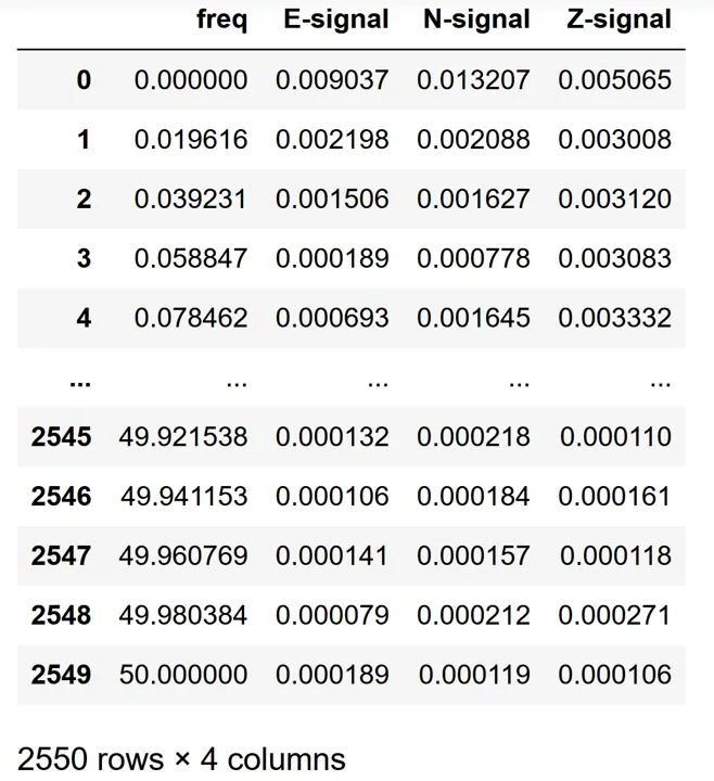 Fourier Spectra data imported as a Pandas dataframe object
Plot the Fourier Spectra of the E component of the record:
    # initialize a figure and axes objects
    fig, ax = plt.subplots()

    # plot the data
    ax.plot(df['freq'], df['E-signal'])
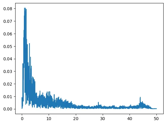 Fourier Spectra of the record
Style the graph and the axis labels
Start by inserting a title for the graph and labels for the graph axis:
    # add a graph title with some styling
    ax.set_title("Fourier Spectra Values", size=22, color="navy", pad=15)

    # add labels for the X and Y axis with some styling
    ax.set_xlabel("Frequency [Hz]", size=14, style="italic")
    ax.set_ylabel("Magnitude", size=14, style="italic")

    fig
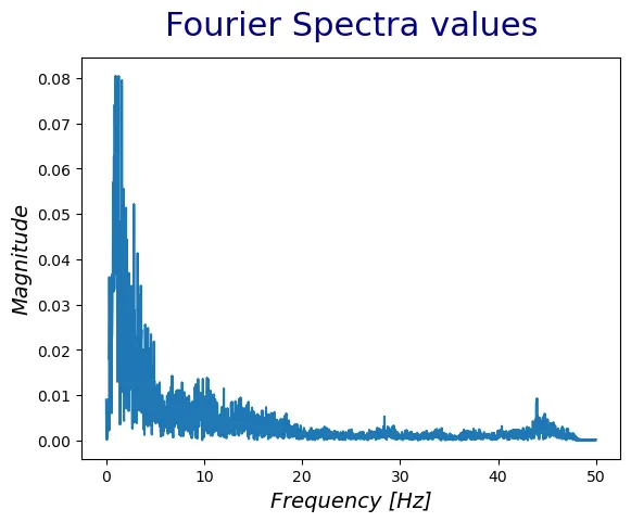 Edit title and axis labels
Utilize various parameters to control the style of the labels such as color for the color, size for the size of the corresponding label, pad for the distance of the label from the graph and more. There are more text properties at the documentation .
Configure the grid and the ticks
At this point we are going to configure the x and y axis ticks, which are the numbers and the lines that show the data labels. Matplotlib contains the tick_params function to change the appearance of ticks, tick labels and grid. In addition, utilize the Matplotlib grid function to style the grid of the graph:
    # edit axis ticks and grid
    ax.tick_params(axis='both', which='both', direction='in', length=4, width=1, colors='black')

    # set axis scale to log
    ax.set_xscale("log")
    ax.set_yscale("log")

    # style the grid
    ax.grid(True, linestyle='-', alpha=0.1, color="grey", which="both", lw=2)
    fig
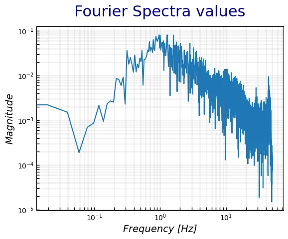 Edit axis ticks and grid style
Since the Fourier Spectra data is usually plotted with “log” scale we use the Matplotlib set_xscale and set_yscale functions to set the scale of the x and y axis respectively. Then, we utilize the tick_params function to configure the tick lines and labels. There are various other parameters that you can control, presented at the documentation. Activate the grid using the Matplotlib grid function and configure its color, width and opacity (alpha).
Configuration of the legend
The last styling to apply is on the legend of the graph. Legend is one of the most important graph characteristics, since it provides information about the graph content. To add the legend, we need to re-plot the data and add a label parameter at the plot() function.
    # initialize a figure and axes objects
    fig, ax = plt.subplots()

    # plot the data
    ax.plot(df['freq'], df['E-signal'], label="E-component")

    # insert graph title and axis labels
    ax.set_title("Fourier Spectra Values", size=22, color="navy", pad=15)
    ax.set_xlabel("Frequency [Hz]", size=14, style='italic')
    ax.set_ylabel("Magnitude", size=14, style='italic')

    # edit axis ticks
    ax.tick_params(axis='both', which='both', direction='in', length=4, width=1, colors='black')

    # edit x and y scale
    ax.set_xscale("log")
    ax.set_yscale("log")

    # style the grid
    ax.grid(True, linestyle='-', alpha=0.1, color="grey", which="both", lw=2)

    # style the legend
    ax.legend(title="2014-07-14 14:08:05 CHN1", loc="upper right", framealpha=0.1, shadow=True)
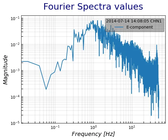 Add and style the legend of the graph
There are many ways to add a legend in a graph. However, the recommend way is to add the label parameter at the plot function. That way, matplotlib knows which item on the graph to refer to. There are a number of parameters to control the appearance of the legend. For instance, use the loc parameter to position the legend, the framealpha parameter to control the opacity of the legend, title to add a title to the legend etc.
Configure the line
Last, it is of great importance the styling of the line in a graph (the Fourier Spectra line in the previous graphs). The configuration of the line is similar to the parameters used to edit the grid of the graph. Some of the characteristics that we can use to configure the line are:
- linewidth or lw, sets the width of the line
- linestyle or ls, styles the line ( line styles )
- color, that controls the color of the line ( named colors )
- marker, that sets the style of the marker ( marker styles )
- markerfacecolor or mfc, sets the fill color of the marker
- markeredgecolor or mec, sets the color of the edge of the marker
- markersize or ms, sets the size of the marker
There are many other parameters that control the appearance of the line at the documentation .
Plot real seismic records
At this point, we will plot real seismological data. We will start by reading data from a MiniSEED file. A MiniSEED file is a binary file used to store time series data in a compact and efficient format that includes information about the station, location, timing, and the actual waveform data. We will use Python ObsPy read function to read the file into an ObsPy Stream object. The Stream object in ObsPy is essentially a collection of multiple seismic records or Trace objects. Each Trace object represents a single continuous time series of seismic data, and a Stream can contain multiple traces that are related, such as different components of the same seismic station or data from different stations.
Read a seismic record into a Stream object:
    # read the recording
    st = read("20150724_095834_KRL1.mseed")
    print(st)

    # Output:

    # 3 Trace(s) in Stream:
    # .KRL1..E | 2015-07-24T09:58:34.000000Z - 2015-07-24T10:06:59.990000Z | 100.0 Hz, 50600 samples
    # .KRL1..N | 2015-07-24T09:58:34.000000Z - 2015-07-24T10:06:59.990000Z | 100.0 Hz, 50600 samples
    # .KRL1..Z | 2015-07-24T09:58:34.000000Z - 2015-07-24T10:06:59.990000Z | 100.0 Hz, 50600 samples
This Stream object contains 3 traces or single time series with different components (E, N, Z). To plot the data, start by looping through the traces contained inside the Stream object. Use the .data attribute of each Trace object to get the data values and the .times() method to get the time from zero till the total record duration length:
    # create a matplotlib Figure and three Axes vertically since we have three components
    fig, ax = plt.subplots(nrows=3, ncols=1)

    # loop through each trace inside the stream object (use the Python "len" function to get the total traces)
    for i in range(len(st)):
        # get the current trace using a simple Python indexing operation
        curr_tr = st[i]

        # get the current Axes again using a simple Python indexing operation
        curr_ax = ax[i]

        # get the component of the current trace using the .stats["channel"] method
        curr_compo = curr_tr.stats["channel"]

        # get the time series data values
        ydata = curr_tr.data

        # get the time values
        xdata = curr_tr.times()

        # plot the current trace at the respective Axes with some styling
        curr_ax.plot(xdata, ydata, color="navy", lw=1, label=curr_compo)

        # add the legend at the top right corner of the graph
        curr_ax.legend(loc="upper right")

    # fix the overlapping graphs
    plt.tight_layout()

    # set the title of the figure by setting the title of the first Axes
    ax[0].set_title("20150724_095834_KRL1", size=12, pad=15)
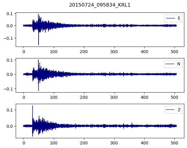 Time series vs acceleration values for each of the three components
There is more functionality at the Python ObsPy library, to process seismic data. Check the ObsPy tutorial. In addition, we could apply more styling to the seismograms, however i leave it up to you to explore the Matplotlib library. Bear in mind that you need to keep it simple and not to add a lot of information at the graph.
Miscellaneous functions
Matplotlib contains a variety of different kind of plots and functions to try. Some of them are very useful into the world of Seismology.
For instance the Matplotlib axhline and axvline are used to draw a horizontal and vertical line across the axes respectively. You can style this line just like you style the plotted line we saw at the previous chapters.
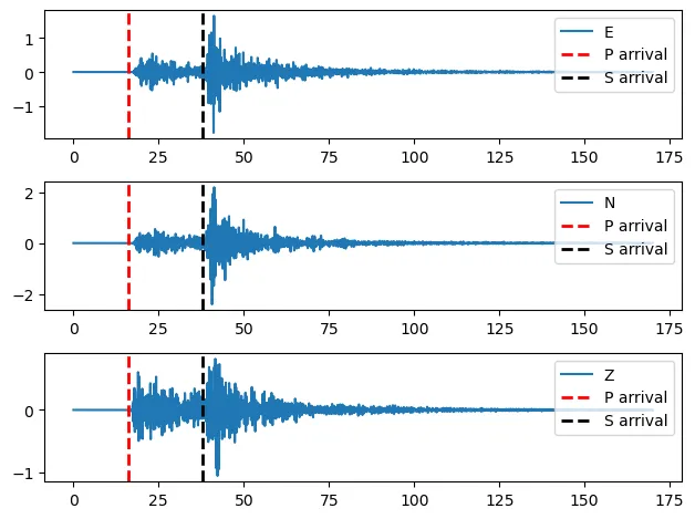 Matplotlib vertical lines depicting the arrivals of the P and the S waves
In addition, Matplotlib functions fill_between and fill_betweenx are used to fill the area between two horizontal or vertical curves respectively. It is often used to highlight regions of interest in a plot or to visually emphasize the difference between two datasets.
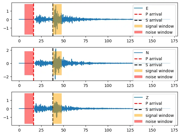 Matplotlib use of fill_betweenx function to create 2 windows with different colors on the waveforms
To continue, Matplotlib subplot_mosaic is a function to create a complex grid of Axes objects with different sizes that extend to more than one row or columns.
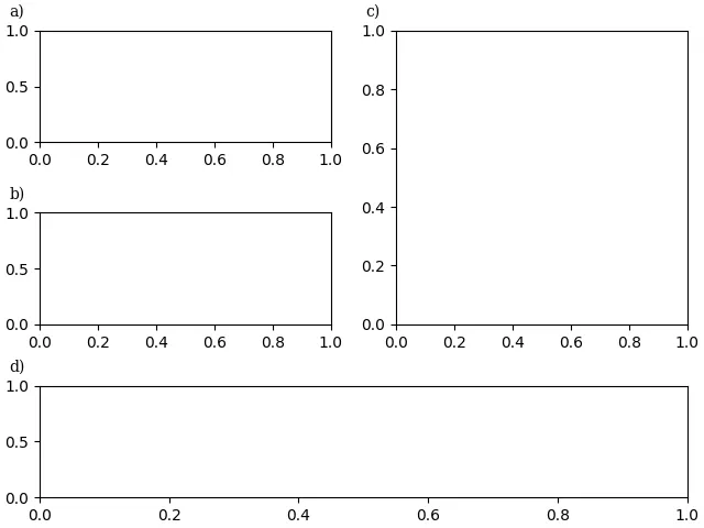 Matplotlib complex grid Axes with different sizes
Lastly, other useful functions that may come handy are the Matplotlib ax.set_xlim() and ax.set_ylim() that set the axis x and y limits, the ax.text() function that generates a text at a specific position at the graph, the ax.annotate() function that creates a box with a text and optionally an arrow that points to a specific location on the graph, ax.scatter() that creates a scatter plot and more .